


Technical analysis is the study of past market data to predict the direction of future price movements. The methodology is considered a subset of security analysis in addition to fundamental analysis. Here is a look at how to use technical analysis in day trading.
This often contrasts with fundamental analysis, which can be applied at the microeconomic as well as macroeconomic level. Micro-level fundamental analysis includes the study of revenues, costs, earnings, assets and liabilities, capital structure and ‘soft’ elements (quality of the management team, competitive position).

Fundamental analysis at the macro level involves the study or forecasting of economic growth, inflation, credit cycles, interest rate trends, capital flows between countries, labor and resource utilization and their cyclicality, demographic trends, central bank and political policy and behavior, geopolitical affairs, consumer and business trends and “soft” data (eg sentiment or confidence surveys).
Some traders may specialize in one or the other, while others use both methods to inform their trading and investment decisions.
Most major banks and brokerages have teams specializing in fundamental and technical analysis. In general, the more information you need to improve the odds of being right, the better the trading results.
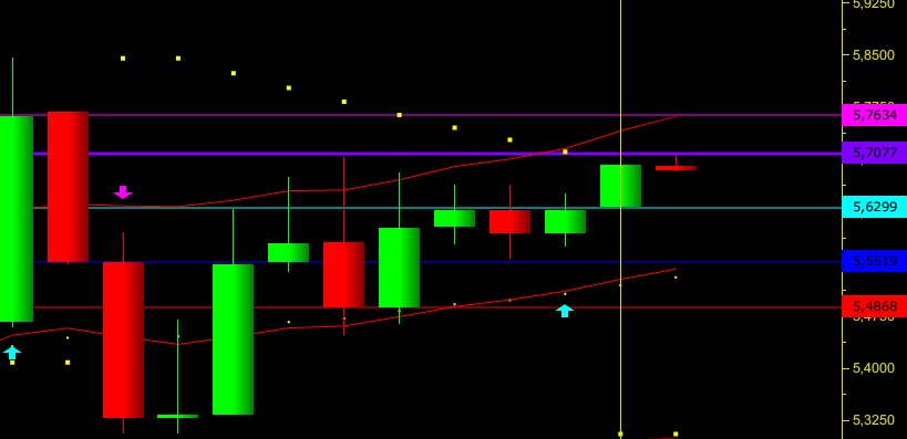
Technical analysts are often called chartists, reflecting the use of charts that display price and volume data to identify trends and patterns to analyze securities. Price patterns can include support, resistance, trend lines, candlestick patterns (eg head and shoulders, reversal), moving averages and technical indicators.
Assumptions in technical analysis
Some traders and investors use both fundamental and technical analysis, but most tend to fall into one camp or the other, or at least rely much more heavily on making trading decisions.
Technical analysts rely on the methodology because of two main beliefs – (1) price history tends to be cyclical, and (2) prices, volume and volatility tend to move in different trends.
Let’s go through each one separately:
Market Cyclicality
Human nature being what it is, with commonly shared behavioral traits, market history tends to repeat itself. The sequence of events may not repeat itself perfectly, but the patterns are generally the same. This can take the form of long-term or short-term price behavior.
In the long run, business cycles are inherently prone to repeating themselves, driven by credit insurgencies where debt rises unsustainably above income for a period and eventually causes financial pain if there is not enough cash available to pay this debt. This tends to result in gradual increases in stocks and other “risk-on” trades (eg, carry trades) during an expansion and a sharp decline during a recession.
Technicians implicitly believe that market participants tend to repeat past behavior because of its collective, patterned nature. If behavior is indeed repeatable, this implies that it can be recognized by looking at price and volume data and used to predict future price patterns. If traders can find opportunities where behavior is likely to be repeated, they can identify trades where the risk/reward is in their favor.
So there is the built-in assumption in technical analysis that the price of a market discounts all information that affects a particular market. Although fundamental events affect financial markets, such as news and economic data, this information, even if it is immediately or immediately reflected in the price of asset prices, will focus on identifying price trends and the extent to which market participants value certain information.
For example, if the US CPI inflation data is a tenth of a percentage higher than what was priced into the market before the news, we can reflect how sensitive the market is to the information by looking at how the asset prices react to it immediately.
If African stock futures go down by X%, the US dollar index rises by Y%, and the yield on ten-year Treasury bonds in Africa rises by Z%, we can get a sense of the influence of such economic input on certain markets. Knowing these sensitivities can be valuable for stress testing purposes as a form of risk management. For example, if inflation were to rise unexpectedly by 1%, we can use data points regarding surprising inflation measurements to determine how the portfolio may be affected.
Price, volume and volatility run in clear trends
Another assumption behind technical analysis (and the broader analysis of securities) is that price does not move along a “random walk” or in any discernible or logical pattern. Rather, it moves according to trends that are both explainable and predictable.
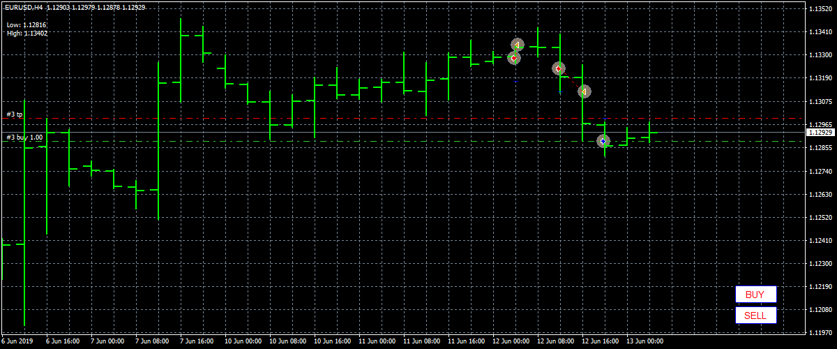
For example, if we look at a chart of the EUR/USD from mid-2013 to mid-2017, we can see how technical analysis played a role by looking at support and resistance within the context of the trend. After the euro began to decline against the US dollar due to divergent monetary policy in mid-2014, technical analysts may have shorted a trade with a return to resistance levels within the context of the downsidetrend (marked with arrows in the photo below). After the trend broke and the market entered consolidation, a technician might have chosen to play the range and started to get long points while exiting any short positions.
Properties
Originally, technical analysis was mostly a matter of ‘reading the tape’ or interpreting the sequential flow and range of price and volume data by a stock counter. As computers became more widespread in the 1970s, data was compiled into map form and became the standard point of a technician.
Chart pattern recognition and bar (or later candlestick) analysis were the most common forms of analysis, followed by regression analysis, moving averages, and price correlations. The number of technical indicators is much more these days. Anyone with coding knowledge relevant to the software program can convert price or volume data into a specific indication of interest.
Although technical analysis alone cannot completely or accurately predict the future, it is useful in identifying trends, behavioral adjustments and potential mismatches in supply and demand where trading opportunities may arise.
Analytical approaches
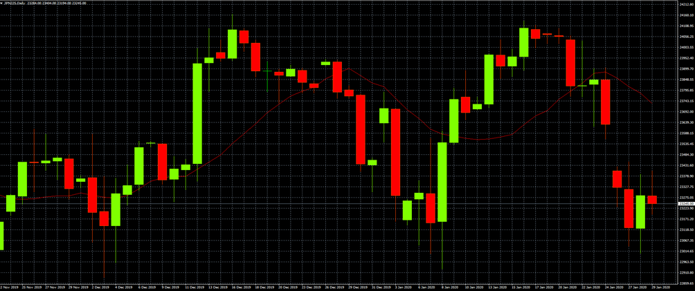
There are different ways to approach technical analysis. The simplest method is by means of a basic chart for candlesticks, which shows the price history and the buying and selling dynamics of the price within a certain period.

(Weekly candlestick price chart of the S&P 500)
Others use a price chart along with technical indicators or use specialized forms of technical analysis, such as Elliott wave theory or harmonics, to generate trading ideas. Some use parts of different methods. At the same time, traders should resist the idea of ‘information overload’ or cluttering charts with so many indicators and lines that it negatively affects the ability to read the chart.
Traders can make a subjective judgment about their trade calls and avoid the need to trade based on a restrictive rule-based approach, given the uniqueness of each situation.
Others may enter into trades only if certain rules apply uniformly to improve the objectivity of their trade and to prevent emotional biases from affecting its effectiveness.

Types of cards
Candlestick
Candlestick charts are the most common form of charting in software today. Green (or sometimes white) is usually used to depict bearish candles, where the current price is higher than the opening price. Red (or sometimes black) is common with bearish candles, where the current price is below the opening price.
It shows the distance between opening and closing prices (the candle body) and the total daily range (from the top of the wick to the bottom of the wick).
(Candlesticks moving up and down in the S&P 500 index)
Open-high low-close
A candlestick chart is similar to an open-low low-close chart, also known as a bar chart. But instead of the candle body showing the difference between the open and close price, these levels are represented by horizontal ticks. The opening price tick points to the left (to indicate that it has come from the past) while the other price bites point to the right.
Line
A line chart connects data points using a line, usually from the closing price of each period.
Territory
An area map is essentially the same as a line diagram, with the area shaded below. This is mostly done to more easily visualize the price movement compared to a line chart.
Heiken-Ashi
Heiken-Ashi charts use candlesticks as the plotting medium, but take a different mathematical formulation of the price. Instead of the standard procedure of candles translated from basic criteria for open-low-low-close procedures, prices are smoothed to better indicate the trending price action according to this formula:
- Open = (Open from previous bar + Close from previous bar) / 2
- Close = (Open + High + Low + Close) / 4
- High = Highest of High, open or close
- Low = Lowest of Low, Open or Close
General provisions
Average true range – the range over a certain period, usually daily.
Breakout – When price breaches an area of support or resistance, often as a result of a significant increase in buying or selling volume.
Cycle – Periods where price action is expected to follow a certain pattern.
Dead cat rejection – If the price falls in a down market, there may be a rise in price where buyers believe the asset is cheap or oversold. However, when sellers allow the market to fall further, the temporary buying spell is known as a dead cat box.
Dow Theory – Studies the relationship between the Dow Jones Industrial Average (an index composed of 30 US multinational conglomerates) and the Dow Jones Transportation Average. Proponents of the theory state that as soon as one of them trends in a certain direction, the other is likely to follow. Many traders watch the transport sector as it can shed insight into the health of the economy. A large amount of goods shipments and transactions is an indication that the economy is on good footing. A similar indicator is the Baltic Dry Index.
Doji – A candle type characterized by little or no change between the open and close price, showing indecision in the market.
Elliott wave theory – Elliott wave theory suggests that markets go through cyclical periods of optimism and pessimism that can be predicted and are therefore ripe for trading opportunities.
Fibonacci Ratios – Numbers used as a guideline to determine support and resistance.
Harmonic – Harmonic trading is based on the idea that price patterns repeat themselves and that turning points in the market can be identified by Fibonacci sequences.
Momentum – The rate of price change with respect to time.
Price Action – the movement of price, as represented graphically by a chart of a particular market.
Resistance – A price level where an abundance of sell orders may be located, causing the price to weigh down from the level. Sufficient buying activity, mostly due to increased volume, is often required to breach it.
Retracement – A reversal in the direction of the prevailing trend, which is expected to be temporary, often to some level of support or resistance.
Support – A price level where a larger order of buy orders can be placed, causing the price to move up from the level. The level will not apply if there is sufficient selling activity than the buying activity.
Trend – Price movement that continues in one direction for a long time.
Indicators for technical analysis
Technical indicators involve a statistical or arithmetical transformation of price and/or volume data to provide mathematical descriptions of up/down movement, support and resistance levels, momentum, trend, deviations from a central tendency, ratio(s) , correlation (s), among other delimitations. Some indicators also describe sentiments, such as short interest, implied volatility, ratios, ‘fear’ or ‘greed’, and so on.
Technical indicators fall into a few main categories, including price-based, volume-based, breadth, overlays, and non-chart-based.
Price-based
Average Directional Index (ADX) – measures trend strength on an absolute value basis.
Average Directional Moving Average (ADXR) – measures the rate of change in a trend.
Commodity Channel Index (CCI) – Identifies new trends or cyclical conditions.
Coppock Curve – Momentum indicator, initially intended to identify bottoms in stock indices as part of a long-term trading approach.
MACD – Plots the relationship between two separate moving averages; designed as a momentum following indicator.
Momentum – The rate of price change with respect to time.
Moving Average – A weighted average price to indicate the trend over a range of values.
Relative Strength Index (RSI) – Momentum oscillator standardized to a scale of 0-100 designed to determine the rate of change over a specific period.
Stochastic Oscillator – Shows the current price of the security or index relative to the high and low prices from a user-defined range. Used to determine market conditions and oversold markets.
Trix – Combine to show trend and momentum.
-Volume based
Money Flow Index – measures the flow of money into and out of a stock over a specified period.
Negative Volume Index – is designed to understand when the ‘smart money’ is active, under the assumption that the smart money is most active on low volume days and not so active on high volume days. Indicator focuses on the daily level if the volume is lower than the previous day.
On-Balance Volume – Uses volume to predict subsequent price changes. Proponents of the indicator place credence in the idea that if the volume changes with a weak reaction in the stock, the price movement is likely to follow.
Positive Volume Index – the indicator is typically used in conjunction with the Negative Volume Index, and is designed to show when institutional investors are most active under the assumption that they are likely to buy or sell when volume is low. Focus on days when the volume is higher than the previous day.
Williams Congestion / Spread – Look at price and volume flow differences between security (or index). It is designed to determine when traders are accumulating (buying) or spreading (selling). For example, if the price makes a new low and the indicator fails to make a new low, it can be considered as an indication that accumulation (buying) is taking place.
Width
Breadth indicators determine how strong or shallow a market move is.
Progress Line – measures how many stocks have advanced (gained in value) in an index versus the number of stocks that have declined (lost value). If an index has risen in value, but only 30% of the stocks are rising, but 70% are lower or neutral, this is an indication that the buying is likely to be only in certain sectors rather than being positive towards the whole market .
If 98% of stocks are higher but only 2% are lower or neutral at the start of the market, this is an indication that the market may be more trendless and that ‘reverting to the mean’ daily strategies may be more effective . However, if a prolonged advance / decline continues, it could mean that the market could trend.
Arms Index (aka TRIN) – combines the number of stocks that are falling or falling with their volume according to the formula:
# of advancing stocks / # of declining stocks) / (volume of advancing stocks / volume of declining stocks)
A value below 1 is considered bullish; a value above 1 is considered bearish. The volume is measured by the number of shares traded, not the dollar amounts, which is a central flaw in the indicator (it favors lower price-per-share stocks, which can trade the higher volume). Nevertheless, it is still displayed on the floor of the New York Stock Exchange.
McClellan Oscillator – Takes a ratio of the stocks that are rising minus the stocks that are falling in an index and uses two separate weighted averages to arrive at the value. Best used when the price and the oscillator diverge. For example, if the price is at a new low, but the oscillator is making a new high, this could be a buying opportunity.Conversely, if the price reaches a new high but the oscillator makes a new low, this could be a selling opportunity.
Overlays
Overlay indicators are placed on the original price chart.
Bollinger Bands – Use a simple moving average and set two lines two standard deviations above and below it to form a range. Often used by traders using a mean reversal strategy, where the price is “stretched” above or below the bands and possibly expected to revert back into the bands.
Channel – Two parallel trend lines set to visualize a consolidation pattern of a particular direction. A breakout above or below a channel can be interpreted as a sign of a new trend and a potential trading opportunity.
Fibonacci lines – a support and resistance tool usually created by plotting the indicator from the high and low of a recent trend.
Ichimoku Cloud – is designed to be an “all-in-one” indicator that provides support and resistance, momentum, trend and generates trading signals.
Moving Average – A trend line that changes based on new price inputs. For example, a simple 50-day moving average would represent the average price of the past 50 trading days. Exponential moving averages weigh the line more heavily against recent prices.
Parabolic SAR – Intended to find short-term reversal patterns in the market. Mostly recommended only for trends in the market.
Pivot Points – Levels of support and resistance determined from yesterday’s open, high, low and close. It is typically used by day traders to find potential reversal levels in the market.
Trend Line – A descending line formed from two or more peaks or troughs on the price chart. A break above or below a trendline can be an indicator of a momentum.
Non-map based
Not all technical analysis is based on charting or arithmetic transformations of the price. Some technical analysts rely on sentiment-based surveys of consumers and businesses to determine where the price is likely to go.
If investor sentiment is somehow strong, surveys can act as a contrarian indicator. If the market is unusually bearish, it can be taken as a sign that almost everyone is fully invested and that few buyers remain on the sidelines to drive prices up further. This may indicate that prices are more likely to decline. Or at least the risk involved in being a buyer is greater than if the sentiment turns sideways.